Planning: Title Design
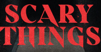
We have been contemplating the use of various different types of fonts and there colors and which would be most effective for our film and genre. The opening credits I came up with for my film will have titles typed in a creepy serif font very similar to that was used in stranger things. This font is shown in the image all the way at the bottom of this blog.
For the placement of our titles I was thinking about putting the director, main title and production studio at the center of the screen and all the other names would be sprinkled in either the bottom left or bottom right corner throughout the opening sequence. I planned on making the titles a gross red maybe even darker than what I'm using at the moment. I would have the titles slowly animated onto the scene letter by letter to add dramatic effect and the director's title would be paired with a pause or end of the music to highlight their importance, most likely towards the end before the main title, these animations would probably last 2-4 seconds each depending on the length of the words. Our working title that we have come up with so far is "The Hunted".


Comments
Post a Comment